Form Builder
Add a form to your process to collect all necessary information during the process automation. This site will show you how...
1.Adding form components
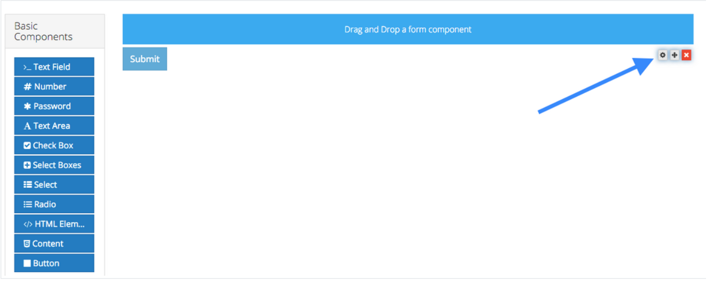
To add a form component to a form, drag and drop the component from the left column into the desired location within the form.
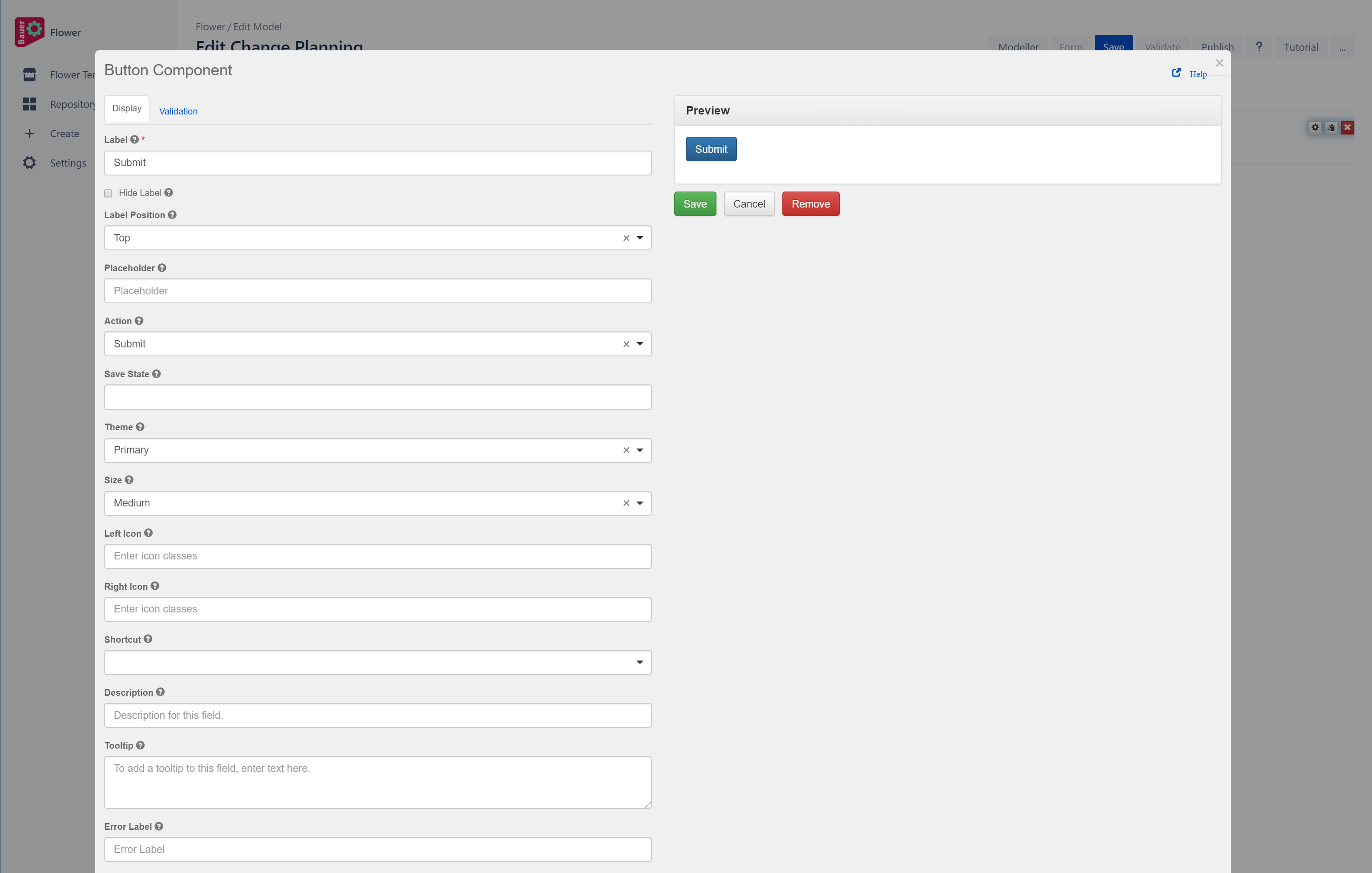
Each new form starts with a submit button automatically added to it. This can be removed or edited as necessary.
A Form component collects user data and serves as the display or user interface within the system. Form components define the type of widget that users will enter their data and will automatically add a property to the resource endpoint to interact with the Form component.
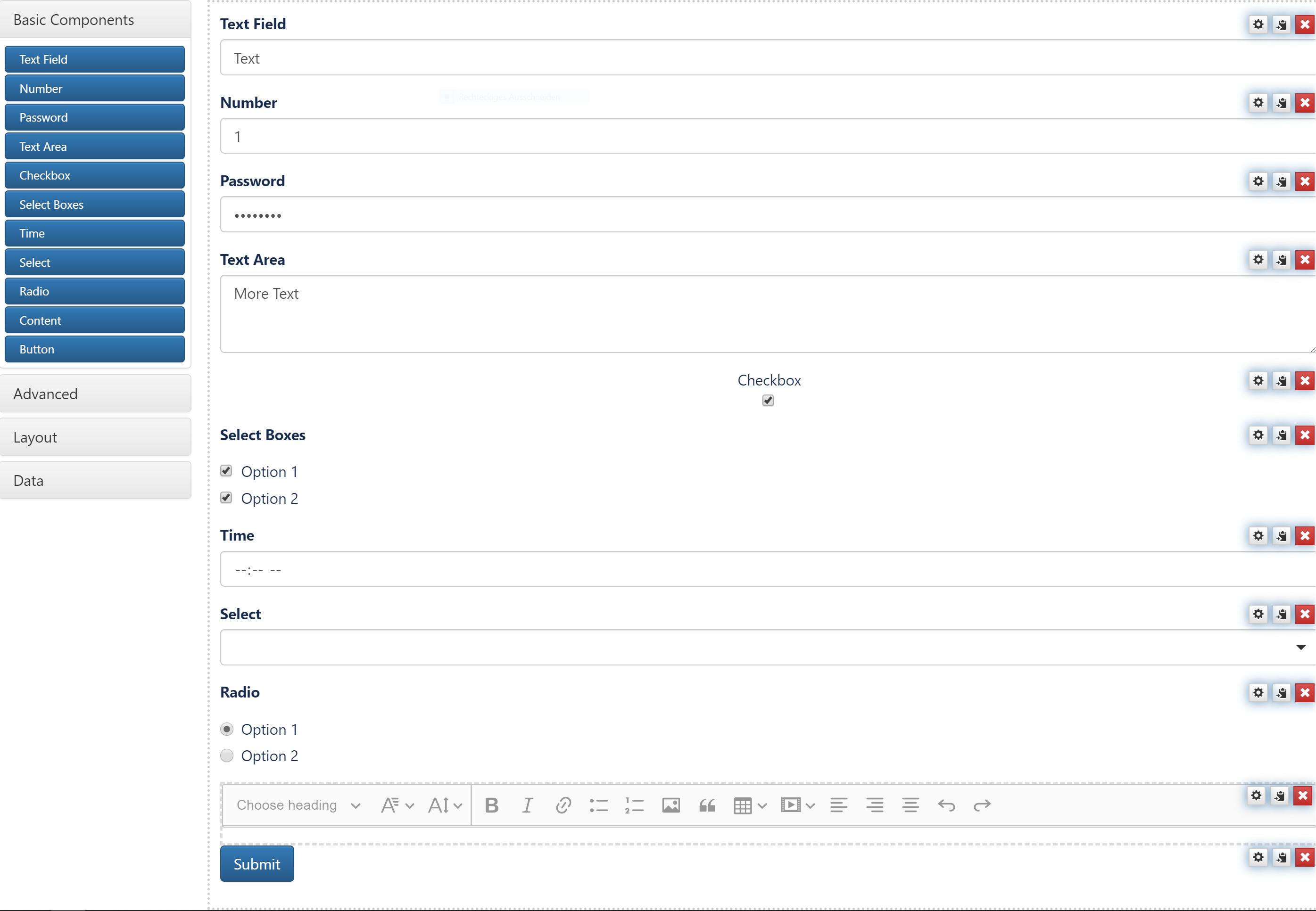
Basic Components:
a. "Text Field" adds a field for text
b. "Number" adds a field for a number
c. "Password" adds a field for a password
d. "Text Area" adds an area for text
e. "Checkbox" adds Checkboxes (multiselect)
f. "Select Boxes" adds Select Boxes (multiselect)
g. "Time" adds a time field
h. "Select" adds a select field (uniselect)
i. "Radio" adds radio buttons (uniselect)
j. "Content" adds content field with various options for adding content
k. "Button" adds a button
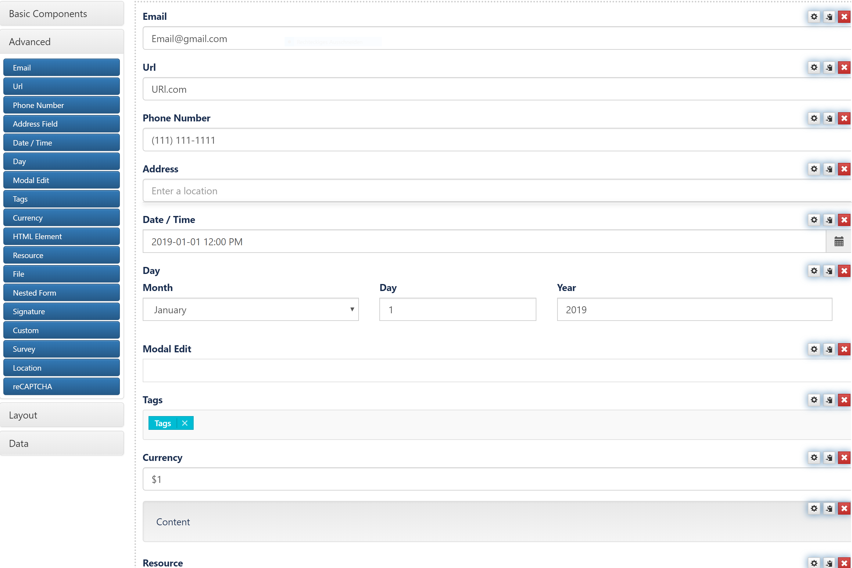
Advanced:
a. "Email" adds a Email field
b. "Url" adds a URL field
c. "Phone Number" adds a field for Phone Numbers
d. "Address" adds a address field
e. "Date/Time" adds a Date/Time field
f. "Day" adds a date field
g. "Modal Edit" adds a modal edit field
h. "Tags" adds a tag field
i. "Currency" adds a currency field
j. "HTML Element" adds a field for HTML Elements
k. "Rescource" adds a field for resources
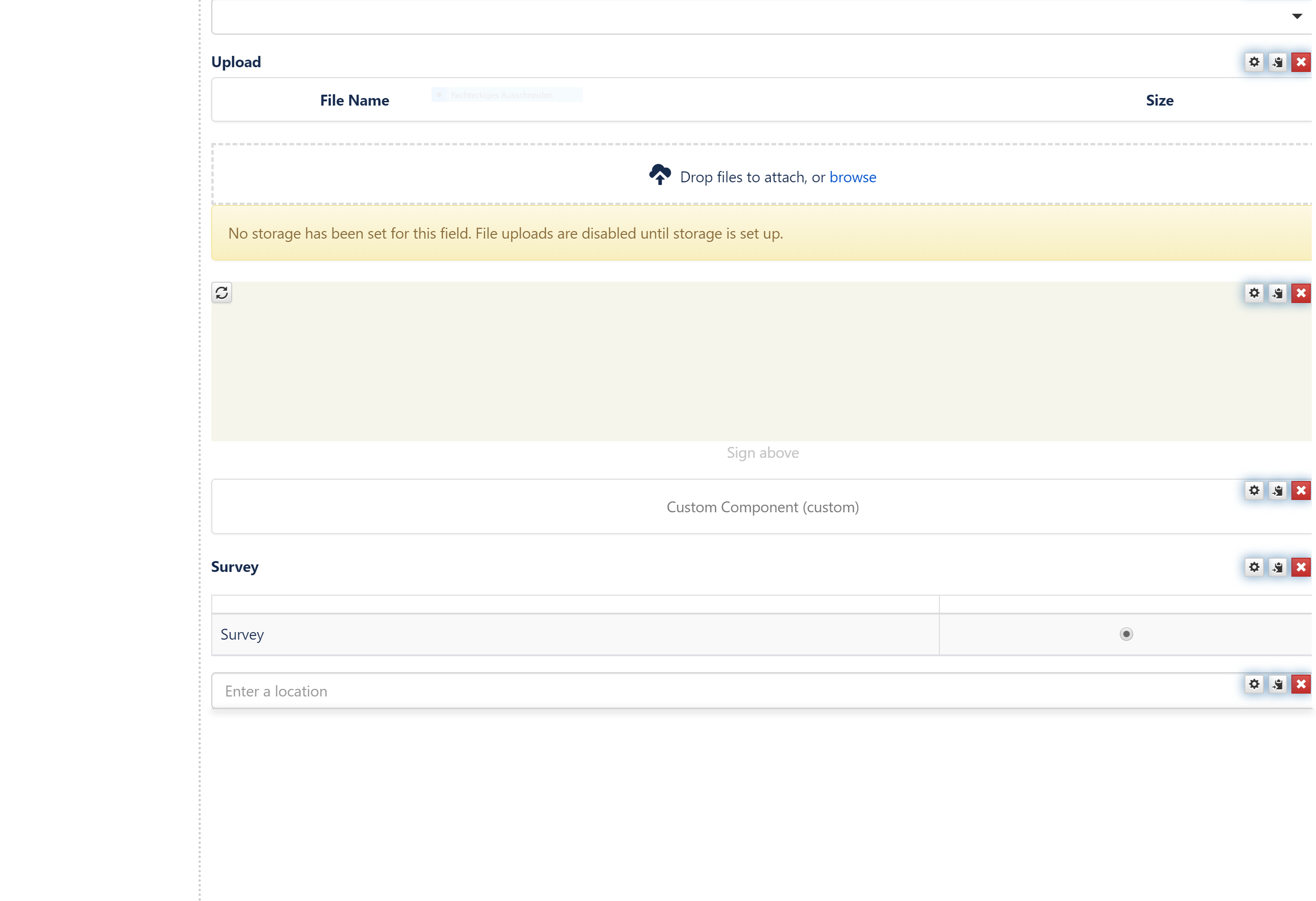
l. "File" adds a file field
m. "Nested Form" adds a nested form
n. "Signature" adds a signature field
o. "Custom" adds a field for customized content
p. "Survey" adds a field for conducting a survey
q. "Location" adds a location field
Layout Components:
Layout Components are used to change the general layout of the Form.
The Column layout component can be used to split any area into two columns. Simply drag and drop the Column button onto the form and the area you drop it on will be split in two.
A fieldset can be used to create a title of an area of the form. This is useful to put inside Layout components or in between lots of related fields. This form component is display only and will not be saved to the api.
Panels are used to wrap groups of fields with a title and styling. These currently map to Bootstrap Panels.
The table component allows creating a table with columns and rows that allow adding additional components within it.
Tabs divide the form into different sites where components can be dropped.
2. Editing a Form Component:
To edit a form component on a form, hover over the component and click the edit icon. You will then be presented with a settings form for the component.
